

About TheDotSite
Small business
Serious website
TheDotSite is a web design and development studio for small and medium businesses. The work is to make a small company look and work like the most credible name in its category — without the agency theatre.
Why we exist
A small company should not look small
Most small businesses lose work online for boring reasons: the site is slow, the offer is buried, the enquiry form is a dead end. It rarely needs a rebrand or a six-month process. It needs someone to make the point clearly and build it properly.
That is the whole studio. Design, build, launch and support, handled end to end by the same person who first asked what the business does.
Who we work with
The audience
Owner-operators and small teams who know their website is underperforming but do not want an enterprise process to fix it. Often a single owner, always one person making the decision.
If the business is bigger than that, the site is probably a product in its own right — a different job.
How the work behaves
Principles
Direct
The useful thing comes first. Headlines are short enough to read at a glance and set large enough to read from across a room.
Warm
Plain language, human tone, no condescension. Small business is personal, and the site should sound like a person.
Exact
The grid is visible. Spacing is deliberate. Every dot, rule and label has a reason to be there.
Bold
Colour is a commitment, not a tint. One saturated field, held with confidence, never a timid gradient.
One identity, five marks
The mark set
The same dot at every size. Each mark has one job, and none of them competes with the headline.

Mark
Watermark, avatar
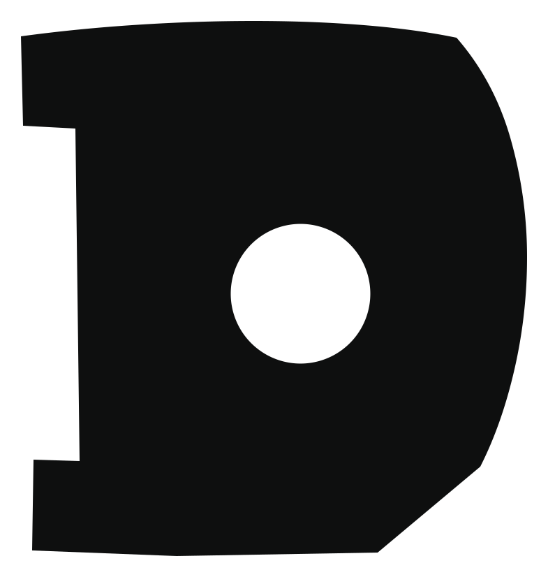
Monogram
App icon, small avatar

Icon tile
Favicon, app icon

Dot
Bullet, loader
Stacked lockup
Square placements
At 16px the icon tile and the dot hold. The monogram takes over small avatars, and the mark is reserved for watermarks at 24px and up.
The short list
What we are not
The wildness lives in colour and scale. The message stays calm and clear. If a choice makes the copy harder to read, it is not on-brand.
- × Precious
- × Jargon-heavy
- × Corporate
- × Trend-chasing
How a project runs
Process
Brief
One conversation about the business, the customers and what the site has to achieve. No discovery deck.
Design
Structure first, then type and colour. You see the real pages, not a mood board.
Build
Payload content model, SvelteKit front end, tested forms and a staging link you can click.
Launch & support
Go live, hand over the admin, and stay on for hosting, updates and the next round of changes.
Next step